This month's Journal Quilt was inspired by the works of Utagawa Hiroshige. I know I had seen his work before but never really paid that much attention to it. After discovering Debra's Journal Quilt Challenge, I joined About.com and found a discussion about an ArtImage Challenge. It turns out that Debra was involved in that as well. Recently she moved over to DelphiForums and hosts a forum called Quilt Studio. Stop by and check it out. Debra has done a wonderful job of setting up and managing the folders: Design Discussion, Study Groups, Challenges, How to's, etc. (Thanks, Debra) Information about the ArtImage Challenge can be found there. In January, Sophie proposed a print by Hiroshige for the winter challenge. It was a lovely print and in my typical in-the-moment enthusiasm I researched Hiroshige. The man was prolific, worked in series and experimented with new techniques. What an inspiration! I sketched some ideas and then, also typical of how I work, I did nothing. 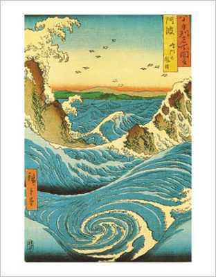 By the second week of March, in a panic (because I had procrastinated starting both the Journal Quilt and the ArtImage pieces), I went back to the works of Hiroshige and found an 1855 print, Navaro Rapids (aka Rough Seas at Awa) done as part of a series called the Famous Views in the Sixty-odd Provinces. Hiroshige's work were block prints and in his later years worked with a publisher Uoya Eikichi on prints of finest quality and adventurous techniques: true gradation of color; adding mica for iridescent effect; embossing; fabric printing; blind printing; glue printing for a glittery effect.
I thought about making a block print and printing on fabric. Instead, I started by tracing a rough outline of the image onto fusible web (the paper side), next I used Fabrico pens and added color to the drawing (on the bondable web.) Next I ironed the fusible web to a piece of silk, took off the paper backing and ironed that directly onto a piece of wool batting. The combination of materials and a hot iron produced a nice effect - kind of like ripples which works nicely in this piece. I added a little more color to the top of the silk and did some decorative threadplay. The piece "finished" smaller than I had intended and I really didn't want to add a fabric border, so...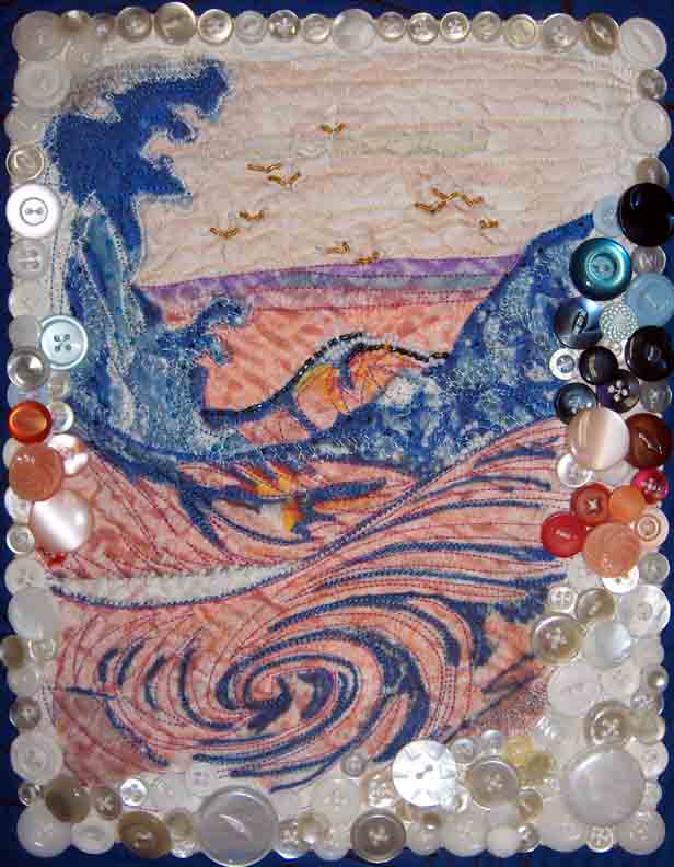
I remembered I had a collection of odds and ends sewing supplies that my mother sent to me after my grandmother had died twelve years ago. I've hardly touched it, but I've held onto lace, zippers, rickrack, buttons, and calico prints. I settled on the buttons, sorted and selected ones that I thought would work. In addition to the buttons, I finished the piece by adding some seed beads. I'm calling this piece "Red Tide" and soon I'm going to get back to the ArtImage challenge but first...
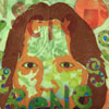
I find this image of dinoflagellates so fascinating. It kind of reminds me of Cat Bordhi's Jester Tentacle bag pictured on the front cover of her book The Second Treasury of Magical Knitting (hat and bag at 9 &10 o'clock positions resp.) I bought the book recently so I could make the Fringed Bowl (5 o'clock) but now I may have to figure out how to make a Dinoflagellate Bowl!
Thursday, March 23, 2006
March JQC2006
Subscribe to:
Post Comments (Atom)


13 comments:
Hi!
My name is manel and i am from portugal.
This blog is good if you want go to .
Hello from Portugal.
www.batalhadeestrelas.blogspot.com
What a creative process resulting in a very nice quilted piece! The luster of the white and off-white buttons reminds me of seashells and fits your theme nicely.
The Hiroshige print is beautiful, and I love your interpretation of it in "Red Tide." Then the connection of dinoflagellates and red tides and Cat Bordhi's Jester Tentacle bag makes it even better... A really interesting piece with interesting "tentacles of thought" emerging from the original.
What a wonderful interpretation! I have to agree that the buttons are different but work just right.
BTW, it was Joy who introduced the Winter Challenge. Thanks for all the nice compliments for me! I love the way the forum is shaping up.
Kim,
This is a very nice interpretation of the original work. Adding all those buttons and beads really punches it up.
Your "Red Tide" is lovely, I can feel the heaving of the sea. How creative to use those buttons as a frame, they add the final oomph that makes the quilt so special. Also enjoyed the info on the dinoflagellates. I like the way your mind works.
Nice work, Kim. I too, like the way the buttons work. They remind me of smooth stones tossed on the beach by the waves. There is a lot of movement.
And thanks for the lecture on Hiroshige!
A great playful "diving in" with new techniques and combination of materials...(esp. the fusable onto the wool)...the pearlesence of the buttons just makes the piece, too!
Which school was your studio in, btw?
very lovely the buttons are wonderful I love it very much
Kim - I LOVE IT! What a great inspiration for your March JournPal...P
What Fun! I love the playful texture of the buttons & the movement in the water.Changing the colors, very very nice. Makes me want to do the Art Image challenge too.
Very striking! I like the button embellishments.
Linda
The redtide is so striking! It's got movement and drama! I just love it and like the others, I think the buttons are just wonderful!
Cheers, Denise
Post a Comment